Brand Identity
Real Problem
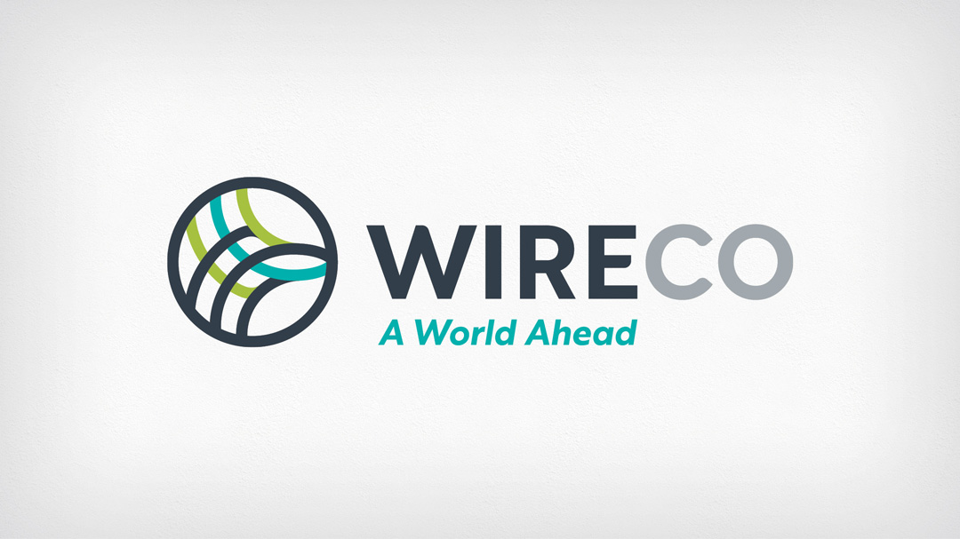
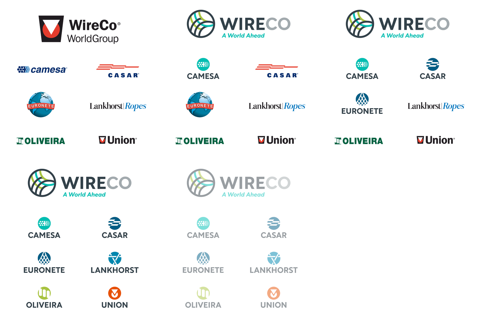
WireCo is an innovative market leader in its industry. Yet its logo and brand image weren’t conveying it. The colors were dark and dated, and the logo mark was designed from a sub-brand within WireCo’s collection. The company’s sub-brands carry significant brand equity within the marketplace, making the connection between WireCo and its sub-brands a stretch for many of its clients and personnel.
Solution
Trozzolo created a new logo with updated colors that symbolized the WireCo commitment to sustainability and continuous improvement. The design incorporated WireCo’s product manufacturing process, with lines that come together, symbolizing how the brands work together and the business pillars unite to drive progress. A new tagline was created to communicate that WireCo’s products are in a class all their own. Around the world, WireCo is relied upon to get the job done right in situations where quality, trustworthiness and experience matter above all else.

View All Work
B
